For a little while I’ve been running daily surveys at my workplace. Each day there was a new survey that people could participate in while they ate their lunch or got a coffee. Qustions ranged from silly ones like, “Who’s you’re favourite Teenage Ninja Turtle?” to more useful ones like, “If we had a 3D printer, what would you use it for?” (I’d still like to get a nice 3D printer at work). This was all going well for a few weeks, but I decided that it was getting a little stale. So last week I ran what I called Know Your Coworkers Week.
On each day of Know Your Coworkers Week there were two true and one false statement about one of the people at work. Everyone else had to write their name under the one they thought was the lie. I promised a prize for the person who correctly picked the most lies.
Know Your Coworkers Week was a huge sucess. Participation far exceeded my expectations with an average of 23 participants per day (out of about 25 people total). It was really cool walking in to the lunch room to find six people all discussing which one they though the lie was. It was even cooler to hear a bunch of people discussing the Persian New Year as one of the sets of statements was about an Iranian guy I work with. Having the fun little competition I’d come up with actually teach people about the cultures of their coworkers was a great feeling.
For the prize, I designed a trophy. The inspiration was the gems from the Playstation game, Spyro The Dragon. The design was a silver gem held up by two black arms, with a round base. I wanted the trophy to have the winners name on it as I think personalisation is a very important part of a gift/prize. 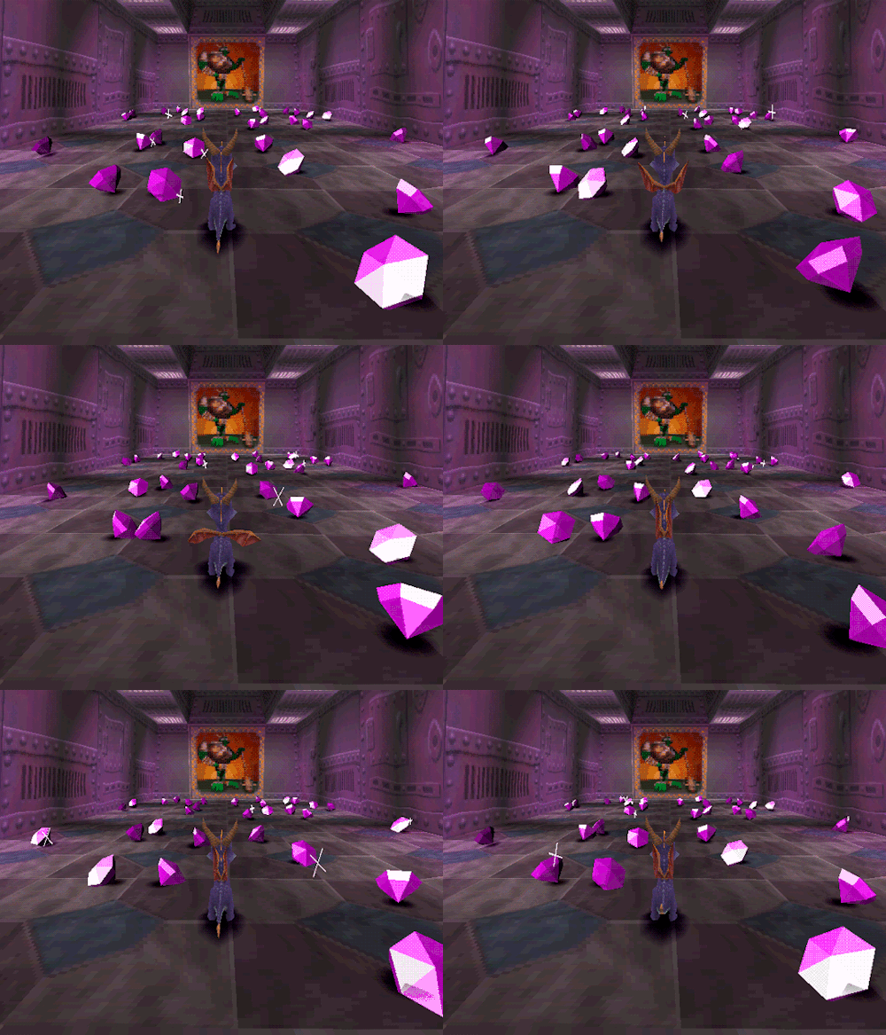 The gems in Spyro The Dragon that inspired the trophy.
I wanted the names of the winners to stand out. The easy way to do text with single colour 3D printing is to have the text embossed or cut into the part. I don’t like that as it doesn’t offer a lot of contrast. I wanted a light coloured text on a dark background. So I tried a few different ways of achieving this.
My first attempt was a two part design. The front part was a thin rectangle with the text in a stencil font cut out of it. The back part had the matching text embossed. When the two parts were combined, it created a flush surface with high contrast text on it.
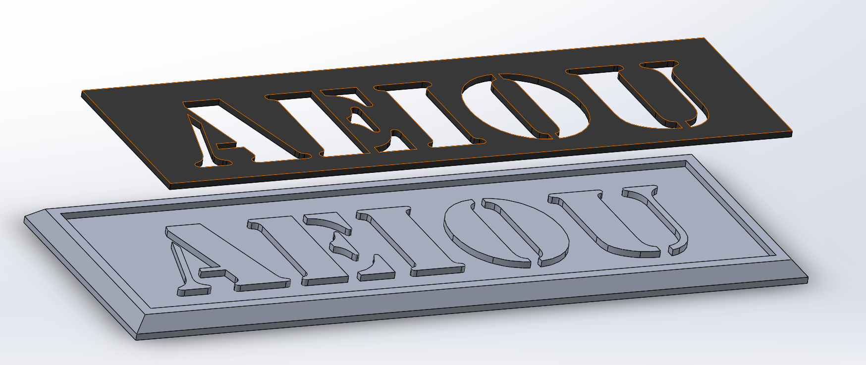 The two part design, exploded.
I was pretty happy with how that turned out, but I didn’t like the stencil font. So I thought about it some more and came up with a three part design. The front part was similar to the last attempt, but with a normal font. The middle part has the text embossed but the ‘floating bits’ of letters like ‘B’, ’D, and ’R’ were cut from the part. Then the back part had the ‘floating bits’ embossed. When combined, it cerated a flush surface with high contrast text and a more readable font than the last attempt.
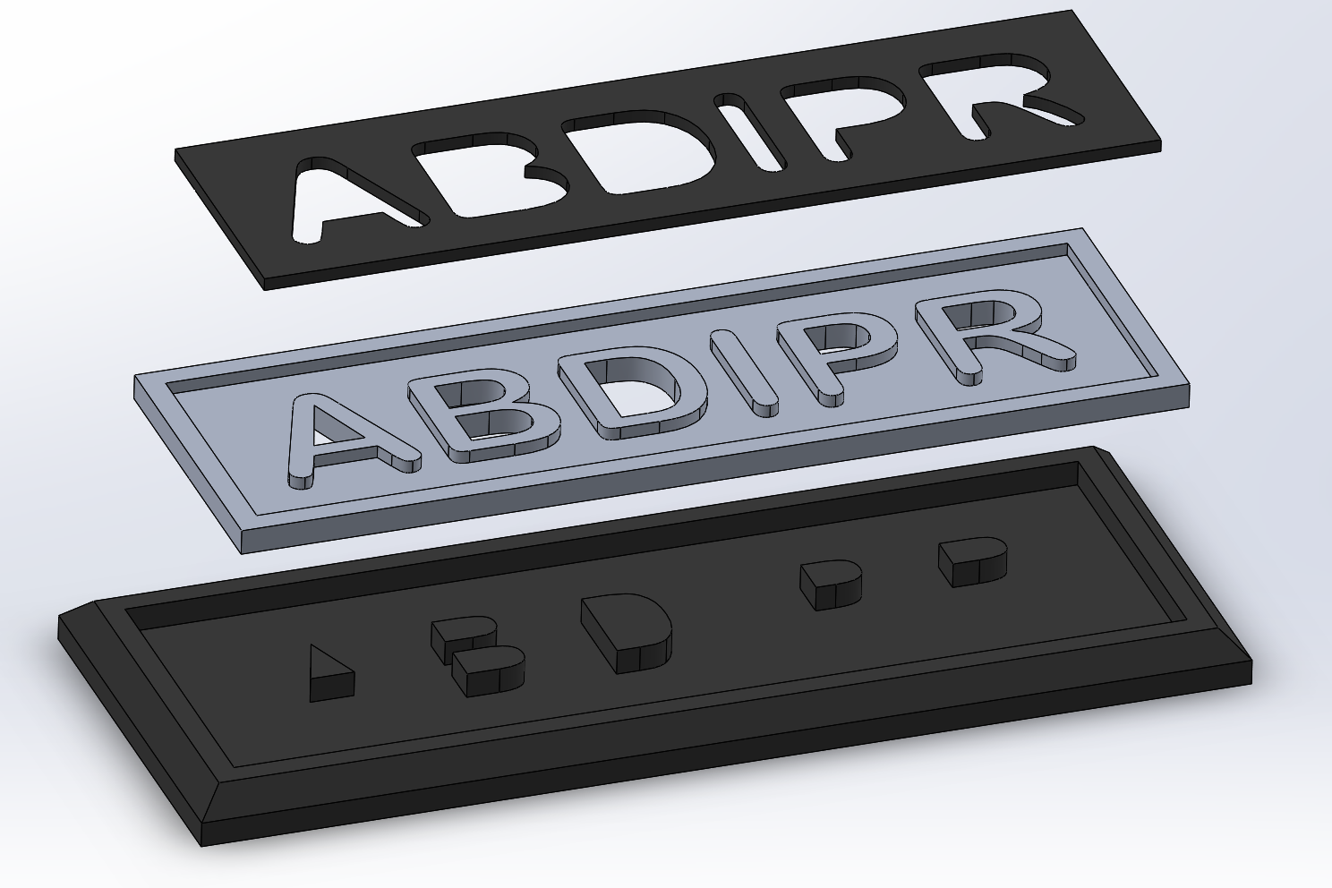 The three part design, exploded.
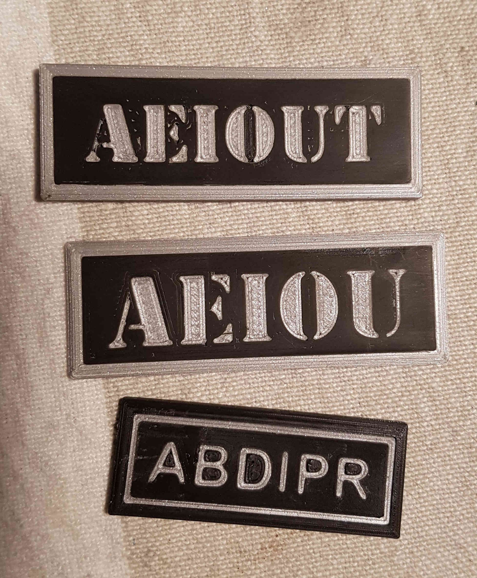 The test prints. The first two are the two part design. Note, they have both been sanded so the white specs is sanding dust that was in the tiny gaps in the printing. They don’t normally look that bad. The third one is the three part design.
With the test prints out of the way, I printed a full set of parts from the black and silver PLA filliment I have. I then glued it all together with super glue (cyanoacrolate). Unfortunatly, two people tied with four correctly picked lies out of five, so I had to print a second trophy.
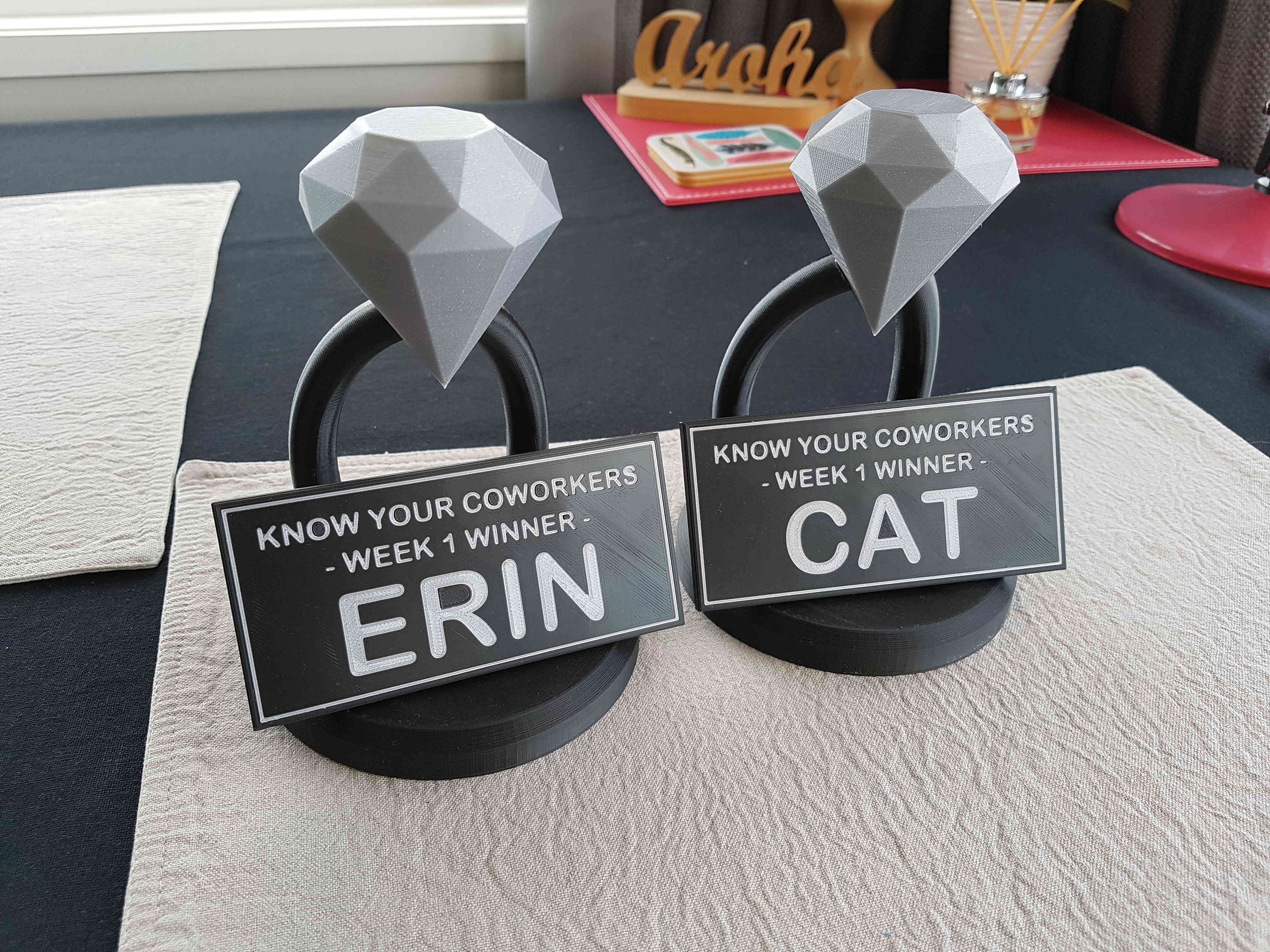 The two finished trophies.
I think the trophies came out really well in the end. I’m quite happy with them. They’re not perfect, but as a prize for a light hearted workplace competition, they are more than adequate. The only thing I don’t like is that they look a little too much like wedding decorations. Regardless, both Cat and Erin seemed really happy with their trophy’s.
The Solidworks files and printable STL files are available on Github.
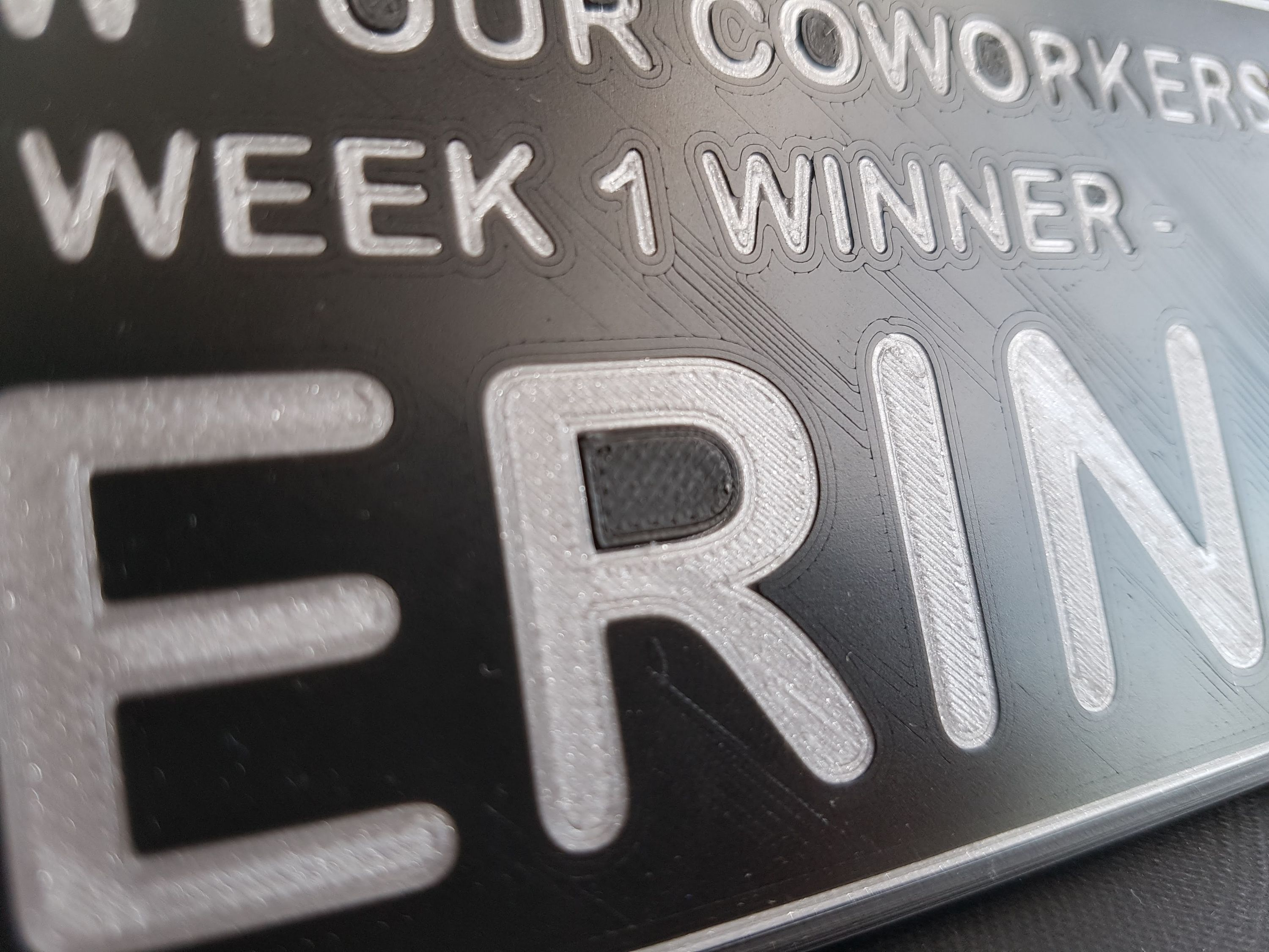 The text up close. It doesn’t look as good, but this picture was taken very close.
 Brass Medal and Treasure Hunt for Mark